
case study · e-commerce ux
Pearson Hybrid Product Detail Page
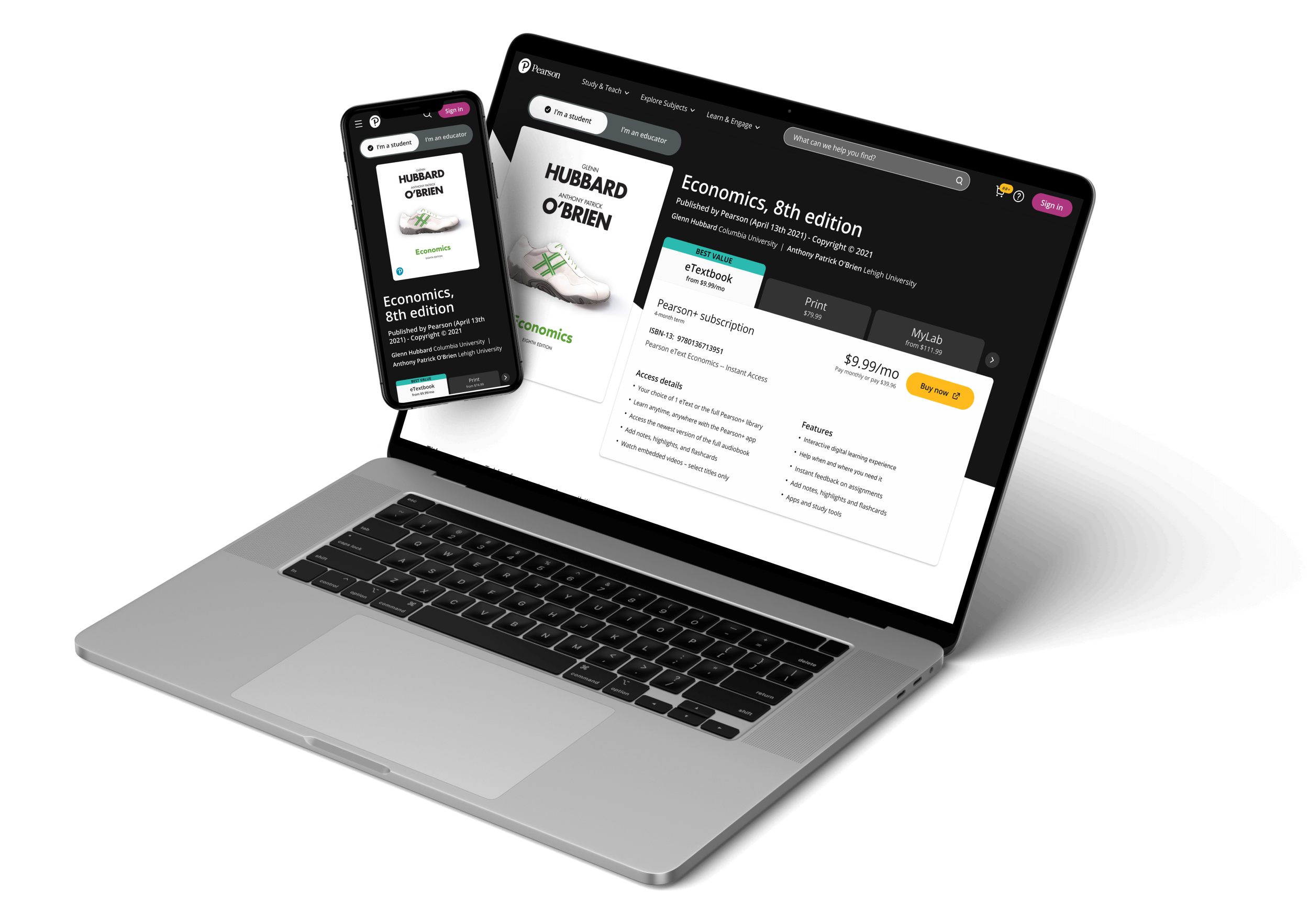
Initial wireframes
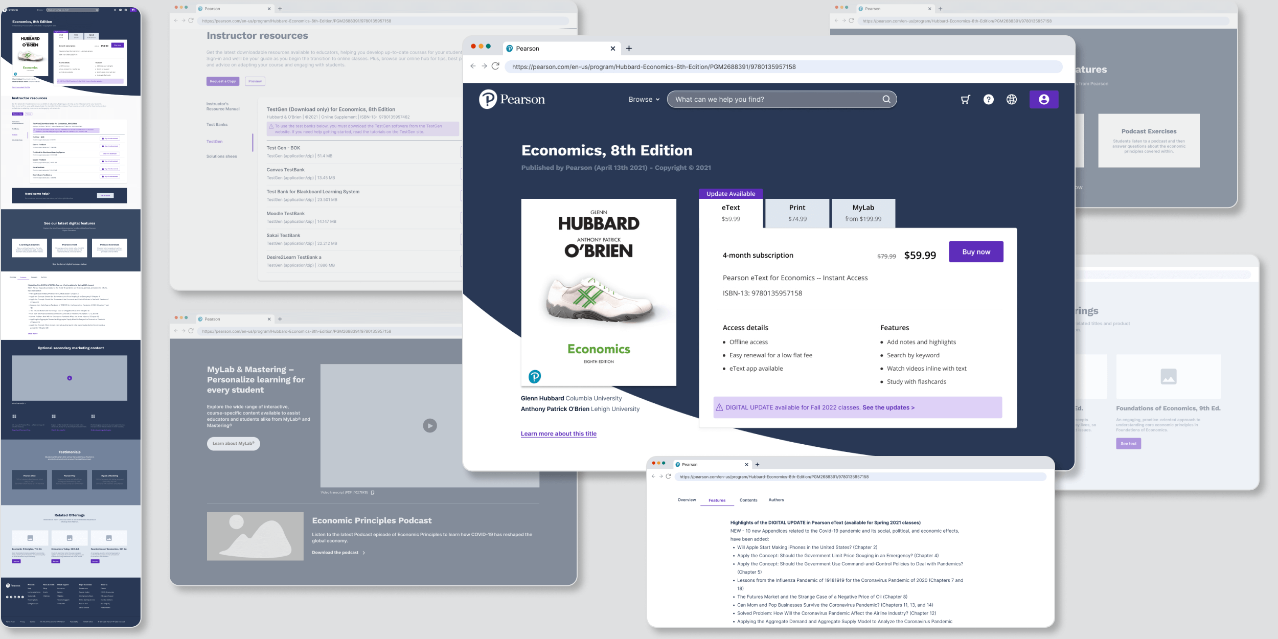
Single page vs. hybrid approach
The original approach was a single search and purchase process for both students and educators, with one Product Detail Page that displayed the product for both groups. It soon became clear that giving students information that wasn’t important to them was interrupting the purchasing experience. At the same time, educators wanted to see more product options right away so they could choose the best package for their course and make recommendations easily.

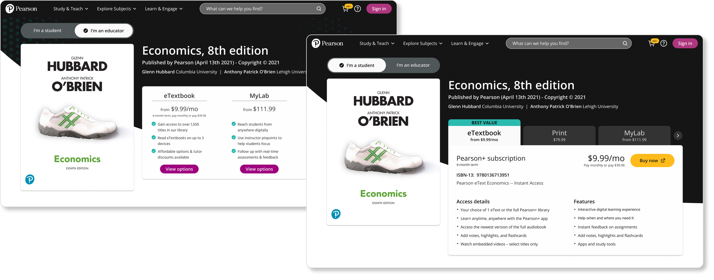
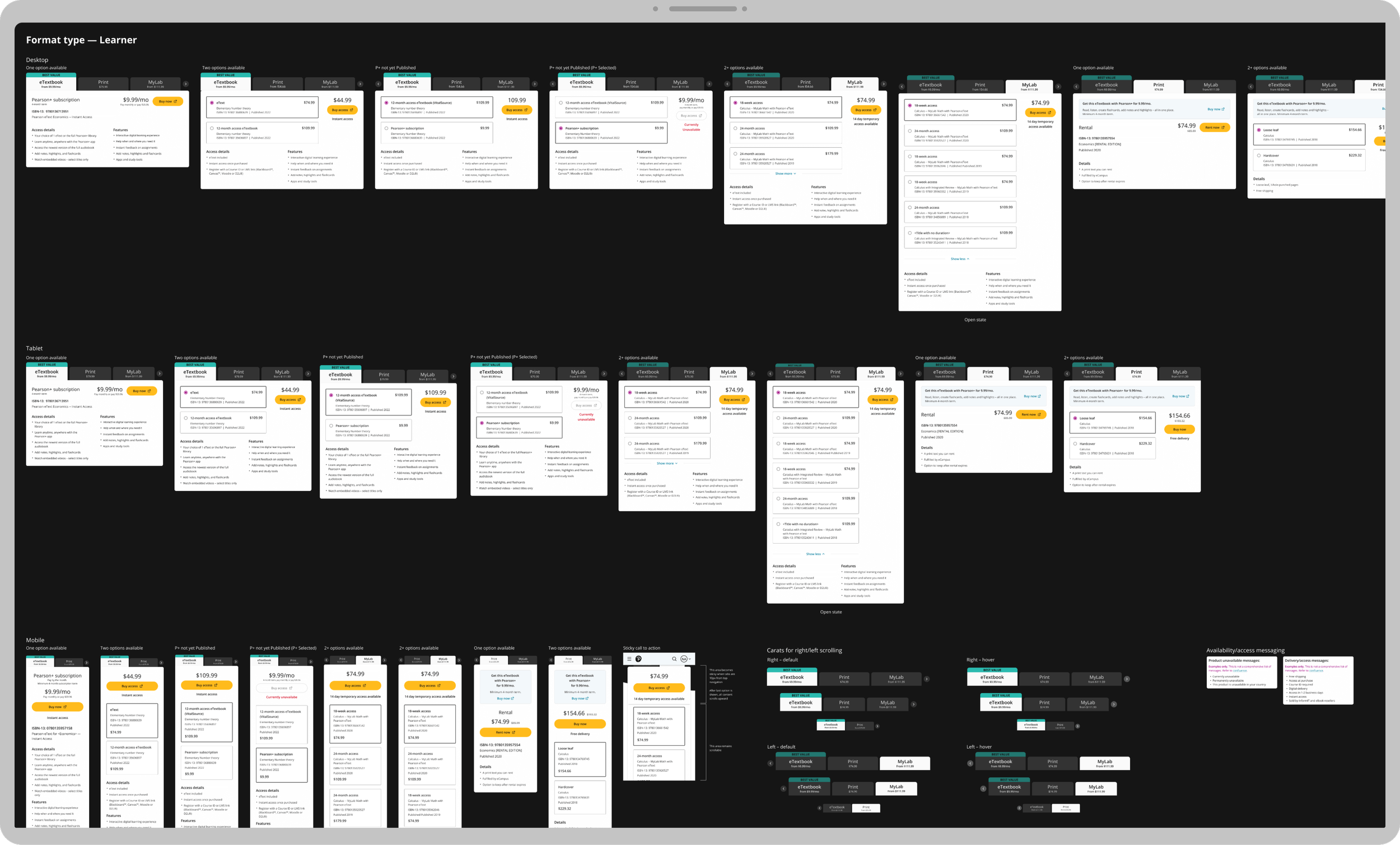
Many format options
Pearson’s products are available in multiple formats and packages. It was important to account for the many possibilities by making the way products are displayed versatile and expandable.
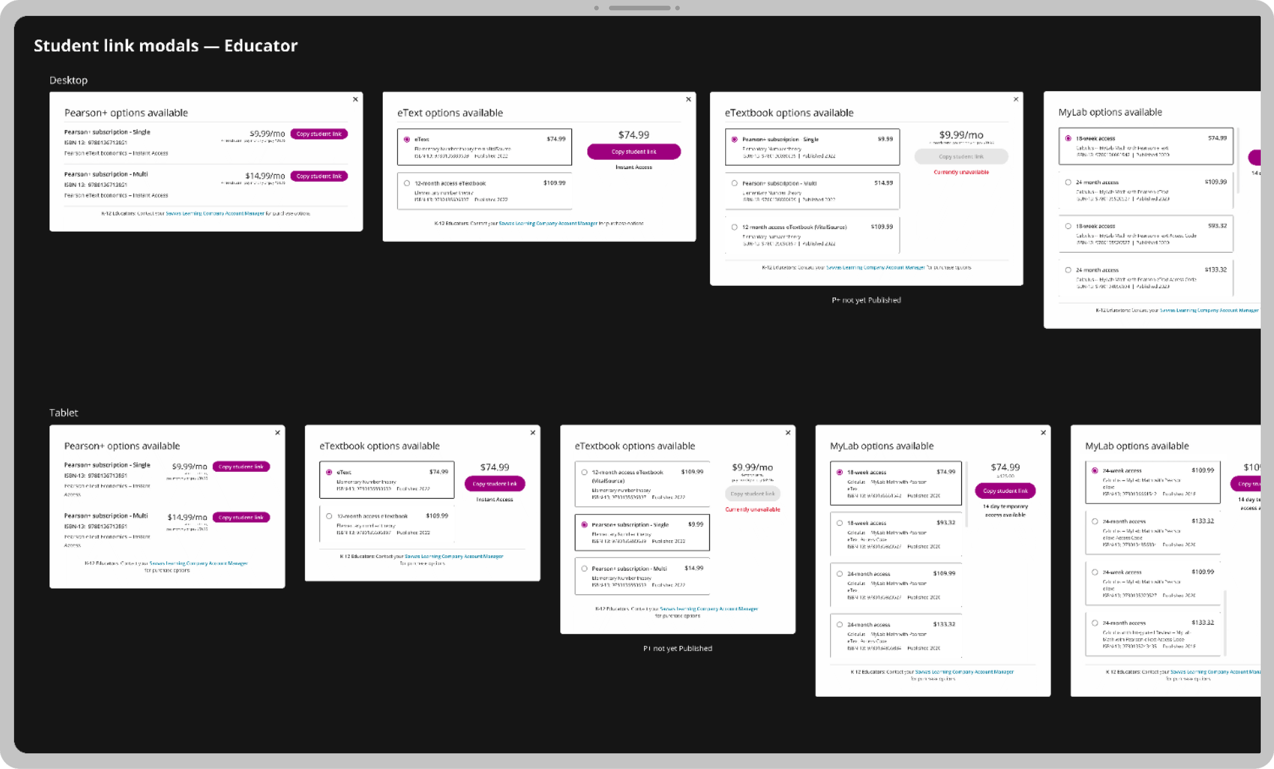
Keeping tabs on product data
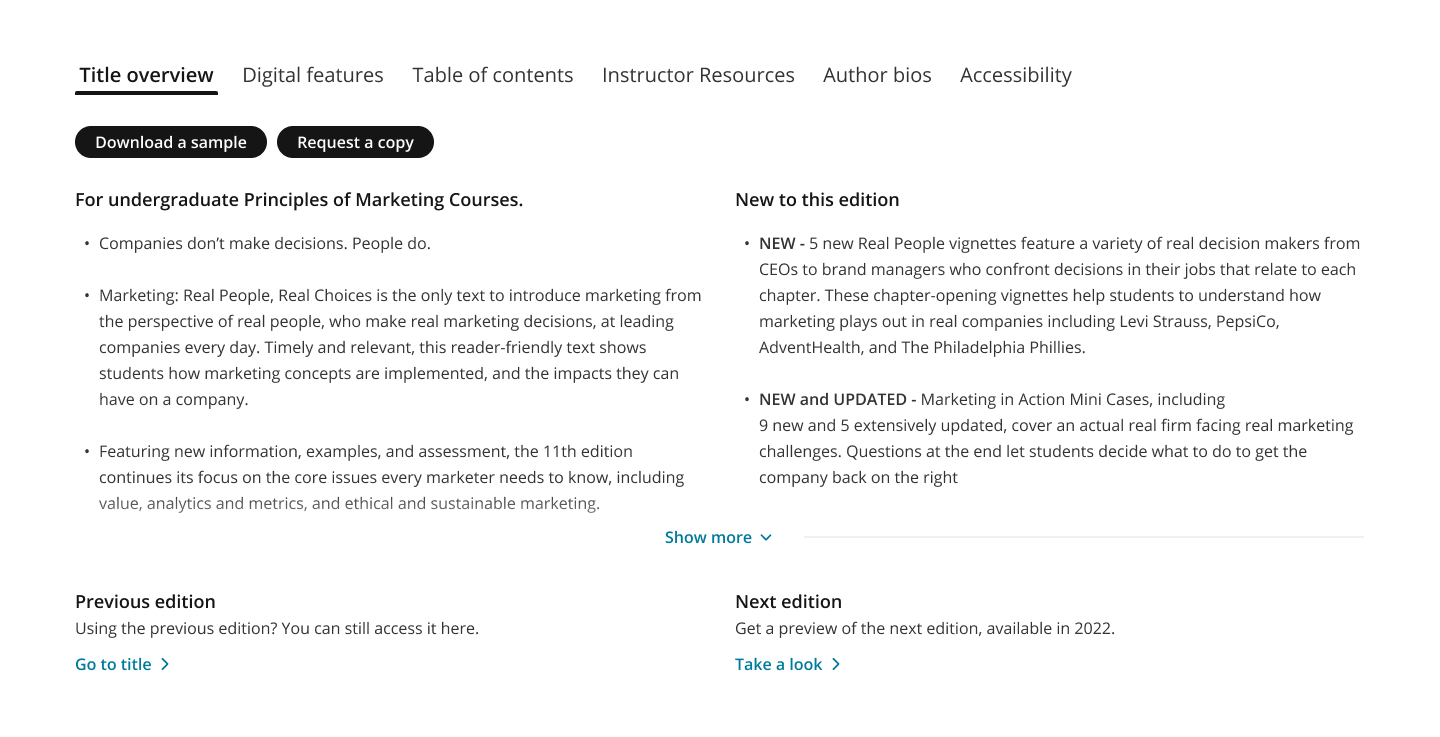
Details about each title live in tabs, tailored to who is viewing.
Additional features
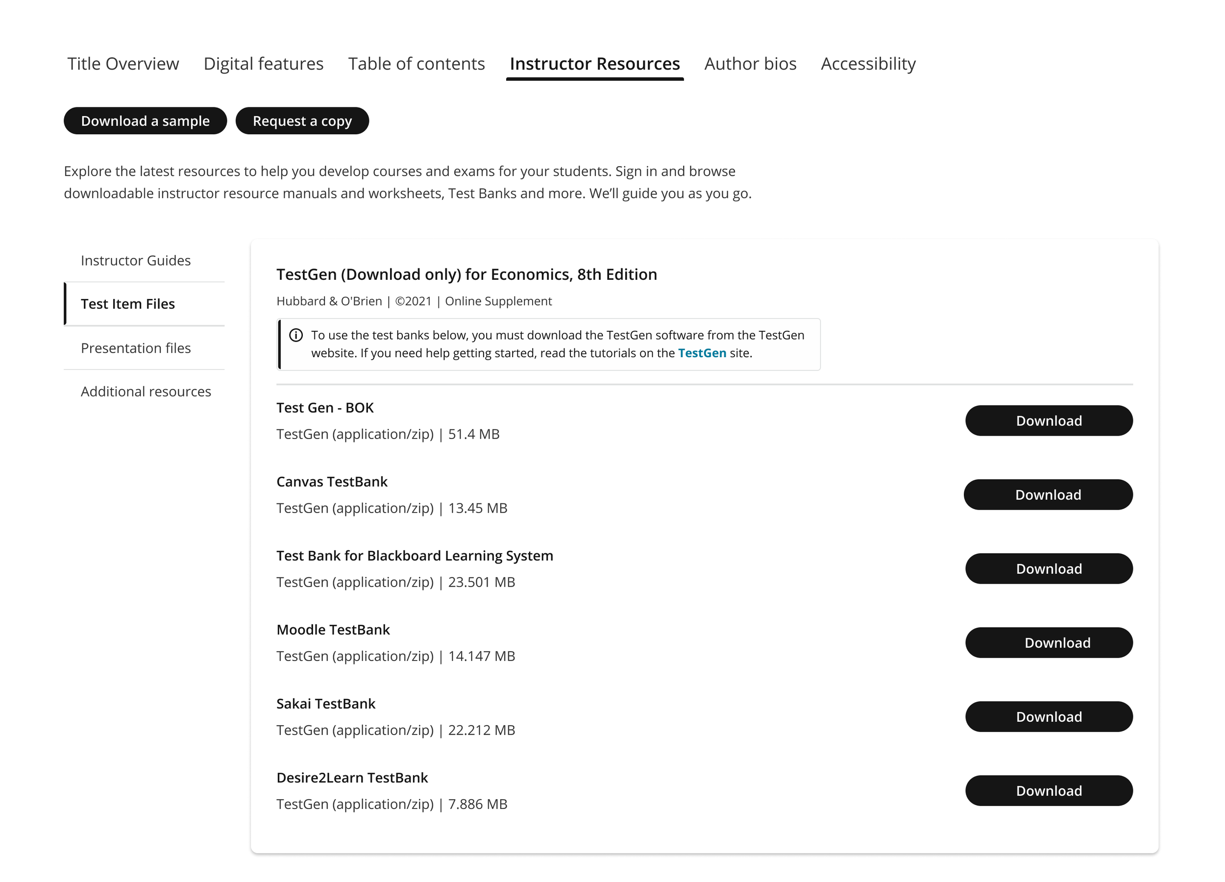
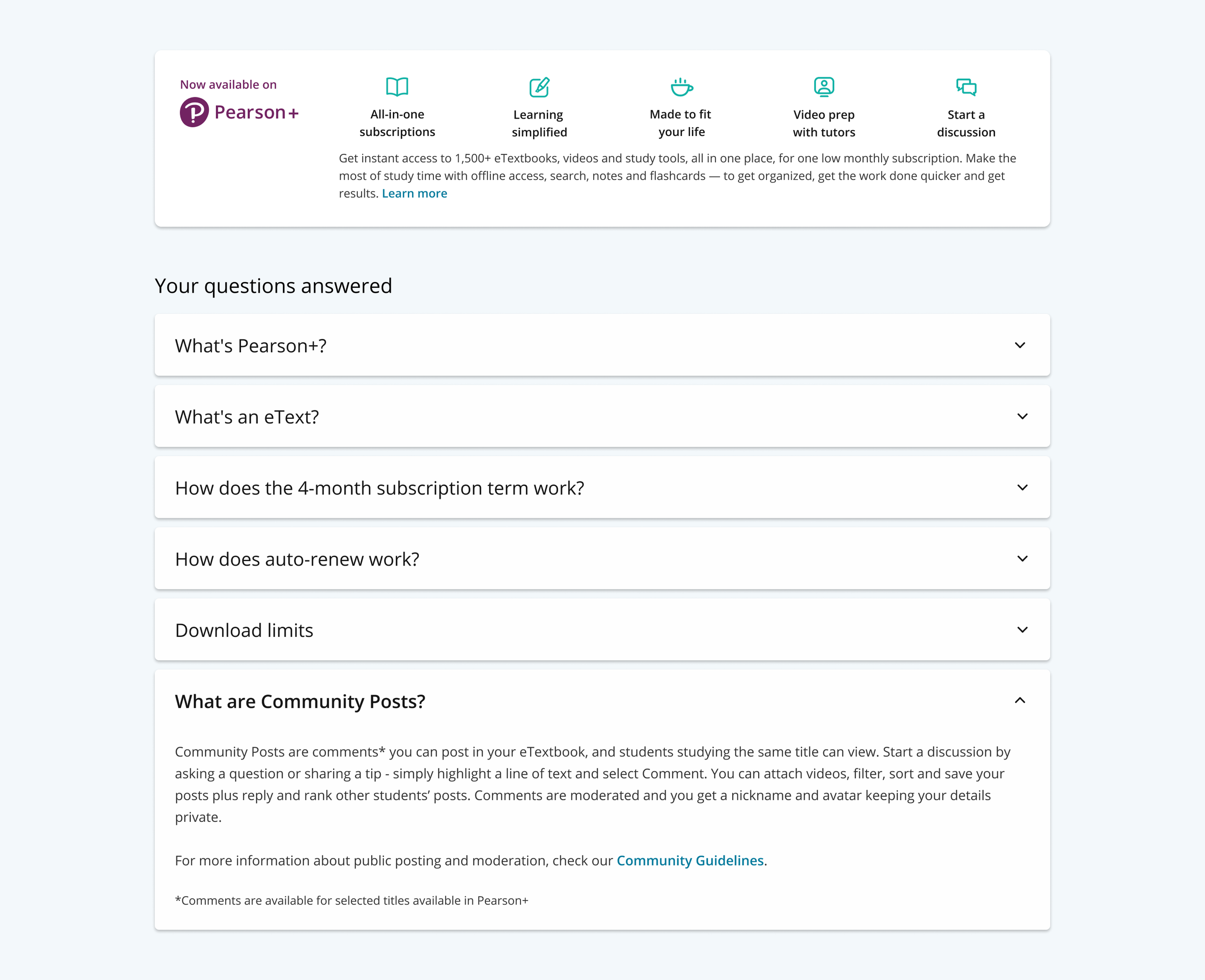
Supporting modules help each audience go deeper on a title.
Results
Measurable improvements to both the educator and student experiences contributed to ~$55M in revenue and 1M+ orders just two years after launch.