Pearson
DCE Design System
Overview:
The Digital Channels and Experience team at Pearson was in charge of simplifying the company's web estate by merging multiple sites into a cohesive and visually aligned portfolio. Since these sites were created by different teams, on different platforms, and with different tools, there were numerous artifacts that made it challenging to maintain consistency. Furthermore, any updates to the company's branding guidelines made it daunting to update the styles.
My role:
I designed and built the DCE Design System from the ground up — continuously improving each component to make them more usable and scalable.


Plan
Audit
I carefully examined the different parts of each website and gathered all of the elements in one central place for analysis. These elements included colors, font styles, buttons, form elements, content sections, and page templates. Next, I organized the parts into groups to help identify any unnecessary duplicates or missing elements.
Analyze
I formed a team of other designers, content strategists, and front-end developers. Together, we had regular meetings where we examined the current designs and made improvements. This involved getting rid of unnecessary duplications and adding missing elements. For instance, we identified all the different button styles necessary to make the buttons more user-friendly and accessible. We also analyzed the form elements to ensure they had all the necessary styles for a useable and accessible form.
Prioritize
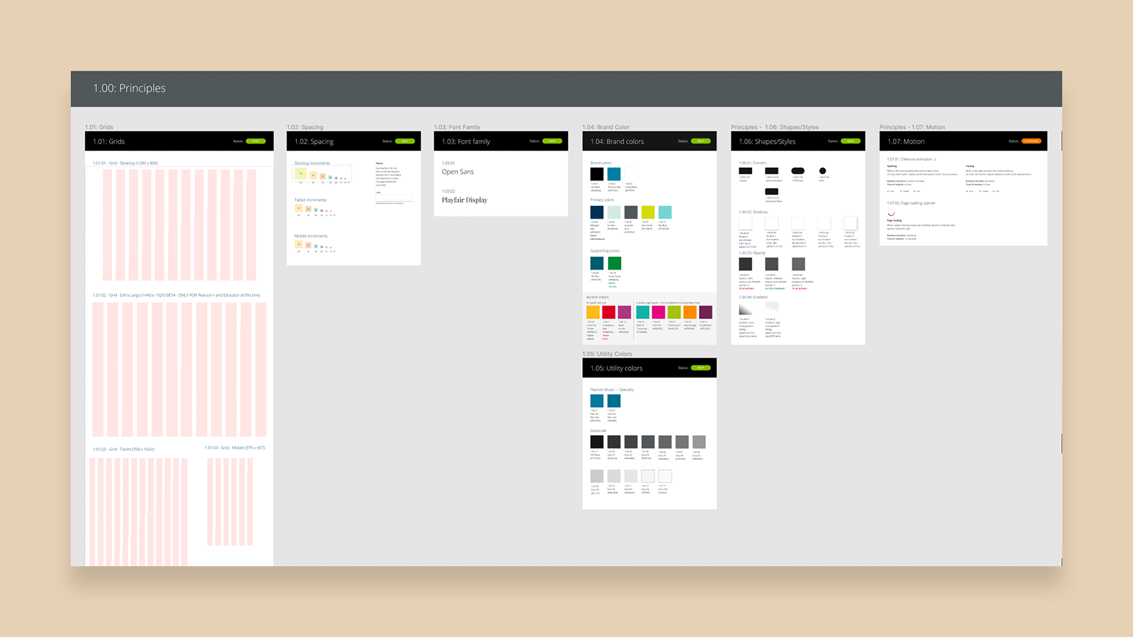
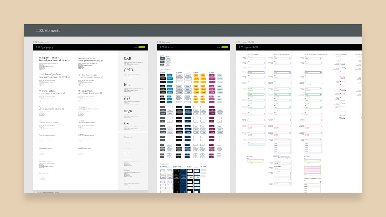
With the assistance of my team, I then divided the artifacts into a progressively more complex set of elements using the Atomic Design approach: Foundations (Grid, Color, Spacing, Typeface, Icons, Shadows, Gradients); Elements (Type Styles, Buttons, Form Elements, Images, Horizontal Rules); Components (Navigation, Highlights, Modal Windows); and Page Templates.
Build
Design
The initial design system was built in Sketch, starting with Foundations, and then progressing to Elements, Components and Page Templates when necessary.
Develop
Once complete, elements of the design system were formally handed off to front-end developers who used a similar method of organizing (Foundations, Elements and Components).
Deploy
A series of training exercises were scheduled to introduce the design system to the design team.
Document
As the design system became more sofisticated, it became necessary to explain how to use each element, and also to document changes, best practices, and how to contribute to the design system. This documentation was housed in Confluence.
improve
Refine
Regular feedback was encouraged to help me identify areas where the design system could be improved, and also a method of introducing new components to be added was introduced.
Elements were regularly updated to improve usability, and responsiveness.
Migrate
Due to changes in the organization, the design system was first moved from Sketch to AdobeXD, and then to its current platform, FIGMA.
Continuous Improvement
The most significant improvements were made in FIGMA, making use of features like auto-layout for flexibility, Variants to make componants easier to deploy with one symbol, and utilizing parent components to simplify making large-scale changes.
SPACING
Spacing guidelines were created to promote consistent spacing across all layouts and breakpoints
TYPOGRAPHY
A robust set of type styles was created for maximum flexibility in page layouts.
COLORS
Pearson’s wide array of brand colors were represented. Utility colors, such as greys and accent colors for alerts and messaging were also included.
ICONS
Icons were improved across all sites to create consistent sizing, line weights and overall style.
BUTTONS
A large assortment of button styles were necessary across layouts. Widespread changes to button styles are made possible through the use of parent symbols. Variants are used to give designer access to all button styles within one component.
FORM ELEMENTS
Form fields also were made using parent symbols. Variants are used to provide designers with access to all input field states within a single component.
MASTHEADS
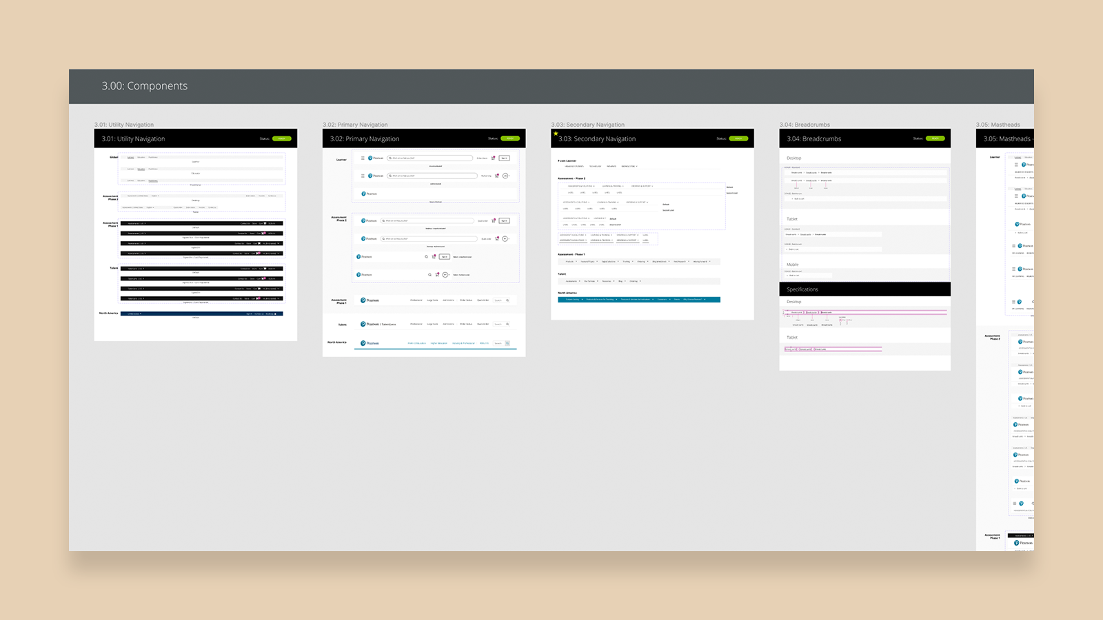
Mastheads across all sites were broken down into their component parts (Main navigation, Utility navigation and breadcrumb) to allow users to deploy various states easiliy and to enable ease of updating.
Heroes
Complex components like heroes are customizable to allow designers to replace headlines, text and background image with ease.
Cards
Using variants, many features can be added to cards while making it easy for designers to navigate and deploy them.


